Typography is more than just selecting a font for a piece of writing. It is an art form that allows for creative expression, visual communication, and effective storytelling. The choice of font can convey emotions, reinforce brand identity, and enhance the overall visual appeal of a design. With the myriad of options available, experimenting with fonts can lead to stunning and unique writing.
Whether you are a designer, writer, or simply someone interested in the world of typography, this blog will explore the art of typography and provide tips and ideas for creating visually captivating writing.
The significance of typography in writing
The significance of typography in writing cannot be underestimated. Typography plays a crucial role in visual communication and can greatly impact the overall effectiveness of a piece of writing.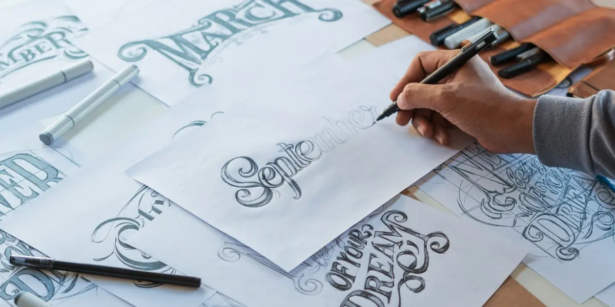 Here are some reasons why typography is important in writing:
1. Visual appeal:
The choice of font can greatly enhance the visual appeal of a design or piece of writing. Different fonts have different personalities and evoke different emotions. A well-chosen font can make a piece of writing more visually captivating and engaging.
2. Readability:
Typography directly affects the readability of a piece of writing. The right font choice, size, and spacing can make a text easier to read and understand. On the other hand, a poor font choice can hinder readability and make the text difficult to comprehend.
3. Tone and mood:
Fonts have the ability to convey different tones and moods. For example, a bold and sleek font may convey a sense of professionalism and seriousness, while a playful and quirky font may convey a sense of fun and creativity. By carefully selecting fonts, writers can set the desired tone and create the intended mood for their writing.
4. Branding and identity:
Typography plays a significant role in establishing and reinforcing brand identity. Many brands have their own custom fonts that reflect their personality and values. Consistently using the same font throughout all brand materials helps to build a strong visual identity and creates a cohesive brand image.
5. Visual hierarchy:
Typography helps to establish a visual hierarchy within a piece of writing. By using different font sizes, weights, and styles, writers can guide the reader’s attention and emphasize key points or headings. This helps the reader to navigate the text more easily and understand the hierarchy of information.
In conclusion, typography is an essential element in writing that can greatly impact the visual appeal, readability, tone, and branding of a piece of writing. By experimenting with fonts, writers have the ability to create stunning and unique compositions that effectively communicate their message.
The power of different fonts to evoke emotions
Different fonts have the power to evoke specific emotions and create a certain atmosphere in writing. The choice of font can greatly influence how readers perceive and interpret a piece of writing.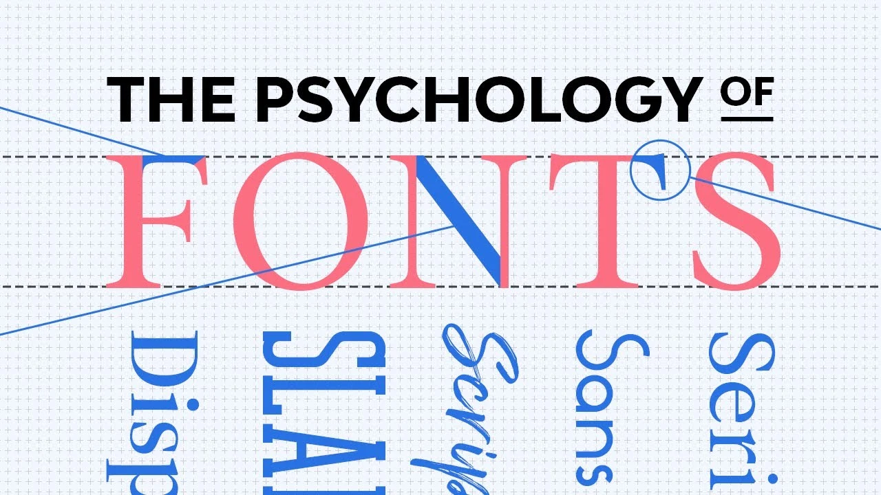 Here are some examples of fonts and the emotions they can evoke:
1. Serif Fonts:
Serif fonts, such as Times New Roman or Georgia, have small decorative lines at the ends of the characters. These fonts are often associated with tradition, professionalism, and formality. They can create a sense of elegance, reliability, and authority. Serif fonts are commonly used in books, newspapers, and academic writing.
2. Sans Serif Fonts:
Sans serif fonts, such as Arial or Helvetica, do not have decorative lines at the ends of the characters. They are often perceived as modern, clean, and neutral. Sans serif fonts are widely used in digital media, websites, and contemporary designs. They can evoke a sense of simplicity, clarity, and informality.
3. Script Fonts:
Script fonts mimic handwriting or calligraphy styles. They can add a touch of elegance, creativity, and personalization to a piece of writing. Script fonts are often used for invitations, greeting cards, and artistic designs. They can evoke emotions such as romance, sophistication, and uniqueness.
4. Display Fonts:
Display fonts are usually bold, decorative, and attention-grabbing. They are designed to be used sparingly for titles, headlines, or logos. Display fonts can evoke a sense of excitement, playfulness, and creativity. They are often used in advertising, branding, and graphic design to create visual impact.
5. Monospaced Fonts:
Monospaced fonts, such as Courier or Consolas, have a fixed width for each character. They are commonly associated with coding, typewriters, or technical writing. Monospaced fonts can create a sense of precision, accuracy, and reliability. They are often used in computer programming, software documentation, and data analysis.
It is important for writers to carefully consider the emotions they want to convey in their writing and choose the appropriate font accordingly. Experimenting with different fonts can help writers find the perfect match for their content and enhance the overall impact of their writing. The power of different fonts lies in their ability to visually communicate emotions and set the tone for the reader’s experience.
Read Also:
- The Ultimate Guide to Understanding and Utilizing Twitter Lists
- In-Depth Exploration: Uncovering Hidden Facebook Comments
- The Pros and Cons of Social Media: An In-depth Analysis
- Step-by-Step Instructions on How to Delete Pin on Pinterest
The influence of typographic hierarchy on readability
When it comes to creating visually stunning and readable writing, typographic hierarchy plays a crucial role. Typographic hierarchy refers to the arrangement, size, and style of different elements of a text, such as headings, subheadings, and body text, to guide the reader’s attention and enhance readability.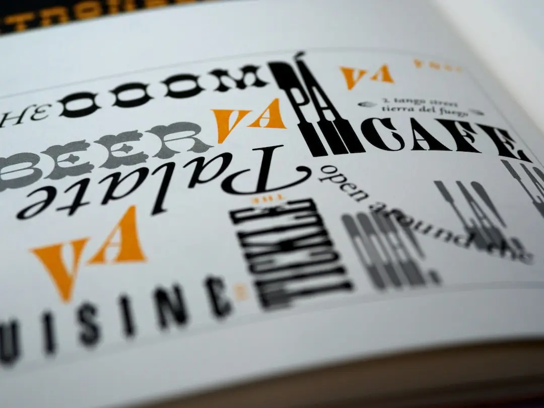
1. Headings:
Headings are typically larger and bolder than the body text, and they are used to convey the main sections or topics in a piece of writing. By using different font sizes and styles for headings, writers can create a clear visual distinction between sections and make it easier for readers to navigate through the content. Bold or capitalized headings draw immediate attention and emphasize the importance of the information they introduce.
2. Subheadings:
Subheadings are used to break down the content within each main section and provide further organization. They are usually smaller than headings but larger than body text. Subheadings can be styled differently from headings, such as using a different font weight or color, to create a hierarchical structure within the text. This helps readers quickly scan through the content and locate specific information.
3. Body Text:
The body text is the main content of the writing and should be set in a legible and comfortable font size. Maintaining consistency in font size and style throughout the body text ensures a smooth reading experience. It is recommended to use a serif or sans serif font that is easily readable both in print and on screens. The spacing between lines, also known as line height or leading, should be adjusted appropriately to avoid overcrowding or excessive spacing between lines.
4. Emphasized Text:
Emphasized text, such as quotes, important points, or keywords, can be highlighted using italic or bold fonts. However, it is important not to overuse emphasized text, as it may diminish its impact. Selectively using emphasis helps guide the reader’s attention to key information and adds visual interest to the text.
5. Bulleted or Numbered Lists:
Lists are used to present information in a concise and organized manner. They are particularly useful for presenting steps, instructions, or key points. Writers can use different bullet or numbering styles to differentiate between different levels of information within the list. Consistency in the style and indentation of the lists improves readability and visual clarity.
By carefully designing and implementing typographic hierarchy, writers can enhance the overall readability of their writing and effectively communicate their message. A well-structured and visually appealing text facilitates comprehension and engages readers, making it more likely for them to fully absorb and appreciate the content.
Experimenting with font pairings for striking aesthetics
The choice of fonts in writing plays a significant role in creating visually striking aesthetics. By experimenting with font pairings, writers can enhance the overall design and appeal of their text. Font pairings involve combining two or more complementary fonts to create a harmonious and visually appealing composition.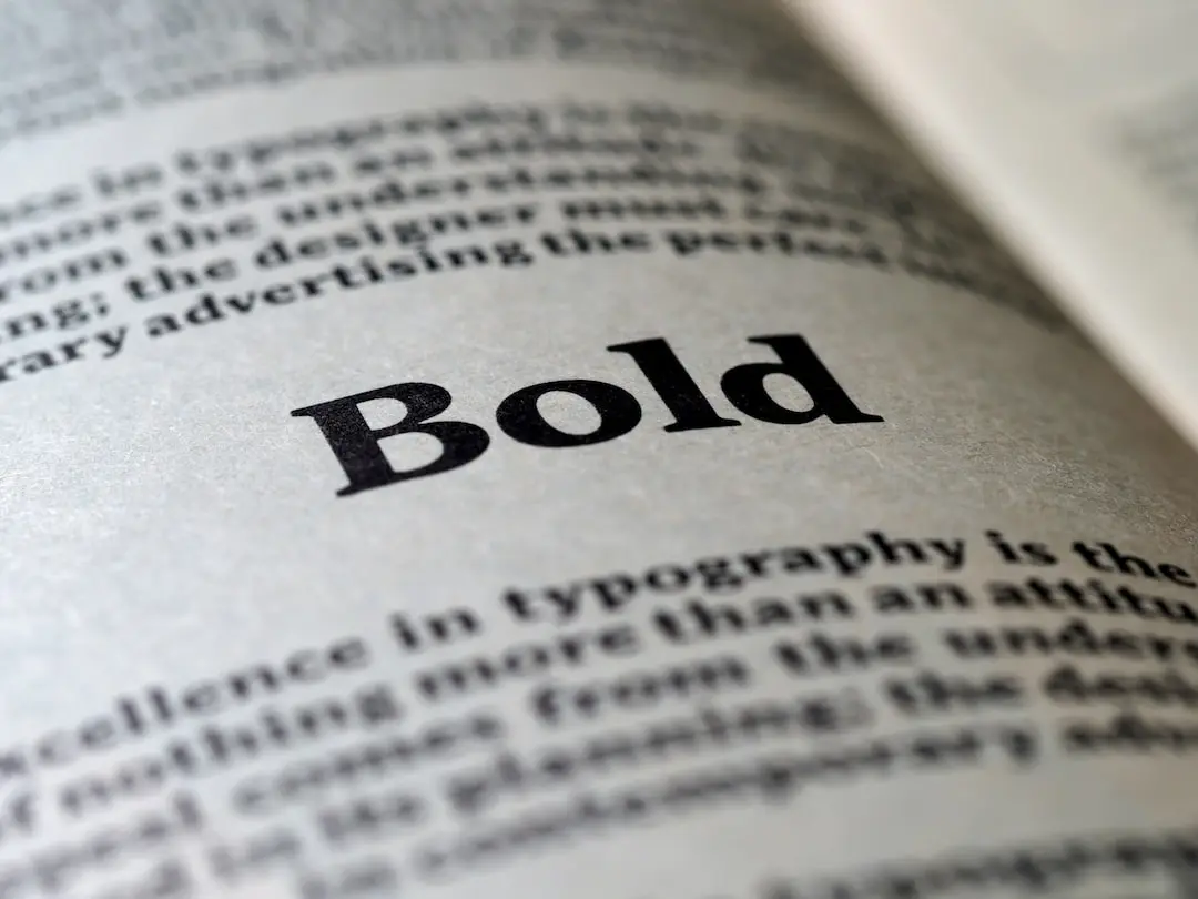
1. Contrast:
When selecting font pairings, it is important to consider contrast. Contrasting fonts can create visual interest and highlight important information. Pairing a bold and heavy font with a lighter, more delicate font can create a striking contrast that attracts the reader’s attention.
2. Complementary Styles:
Font pairings should also consider complementary styles. Choosing fonts that have distinct characteristics can add depth and variety to the text. For example, pairing a modern, sans-serif font with a classic, serif font can create an interesting juxtaposition that adds a unique visual appeal.
3. Readability:
While experimenting with font pairings, it is essential to prioritize readability. The fonts selected should be legible and easy to read, both in print and on screen. Avoid pairing fonts that are too similar in style or weight, as it can create confusion and hinder readability.
4. Consistency:
Maintaining consistency is key in font pairings. Select a primary font for headings and subheadings, and choose a complementary font for body text. Consistent font choices throughout the text create a cohesive and aesthetically pleasing design.
5. Hierarchy:
Font pairings can also be used to establish typographic hierarchy. By selecting fonts with varying weights and styles, writers can differentiate between headings, subheadings, and body text, guiding the reader’s attention and enhancing readability.
6. Experimentation:
Don’t be afraid to experiment with different font pairings. Try mixing different font styles, weights, and sizes to find the combination that best captures the aesthetic and tone you want to convey. There are countless font options available, so take the time to explore and find the pairing that resonates with your writing style.
In conclusion, experimenting with font pairings can elevate the aesthetics of your writing and create a visually striking composition. By considering contrast, complementary styles, readability, consistency, and hierarchy, writers can create a visually appealing text that engages readers and enhances their overall reading experience.
Utilizing font styles to enhance the overall design of your writing
Font styles can greatly enhance the overall design of your writing. By carefully selecting and utilizing different font styles, you can add depth, personality, and visual interest to your text.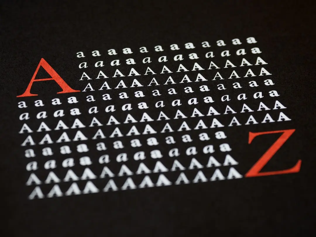 Here are six ways to utilize font styles to enhance the design of your writing:
1. Emphasize key information:
Use bold or italic font styles to draw attention to important words or phrases. By adding emphasis, you can guide the reader’s focus and highlight crucial information within your text.
2. Create hierarchy:
Utilize different font sizes to establish a visual hierarchy within your writing. Larger font sizes can be used for headings or titles, while smaller font sizes can be used for subheadings or body text. This hierarchy helps readers navigate your content and understand its structure.
3. Establish tone and mood:
Different font styles have unique characteristics that can convey specific emotions or atmospheres. For example, a script or calligraphy font can add elegance or whimsy, while a sans-serif font can give a modern and clean impression. Choose font styles that align with the tone and mood you want to convey in your writing.
4. Enhance readability:
Font styles can also impact the readability of your text. Avoid using overly decorative or complex fonts that may be difficult to read. Instead, opt for clean and legible font styles that prioritize clarity and ease of reading.
5. Use font combinations:
Mix and match different font styles to create visual interest and variety. Combining a serif font with a sans-serif font, for example, can create a pleasing contrast and add depth to your design. Just be mindful of choosing fonts that complement each other and maintain readability.
6. Consistency is key:
While it’s important to experiment with different font styles, it’s also crucial to maintain consistency throughout your writing. Use a limited number of font styles and stick to them consistently. Consistency helps create a cohesive design and prevents your text from looking cluttered or disjointed.
By utilizing font styles effectively, you can enhance the overall design of your writing and create a visually engaging and aesthetically pleasing composition. Experiment with different font styles, but remember to prioritize readability and maintain consistency for a polished and professional result.
Balancing creativity with legibility in typography
Maintaining a balance between creativity and legibility is crucial when it comes to typography. While experimenting with different font styles can add visual interest to your writing, it is important to ensure that the text remains easily readable.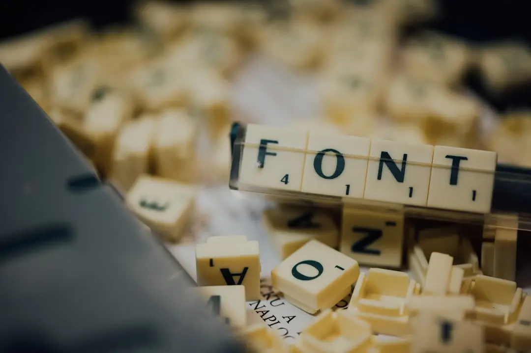 Here are some tips to help you achieve this balance:
1. Choose legible fonts:
When selecting fonts, prioritize readability over novelty. Avoid overly decorative or complex fonts that may be difficult to read, especially for longer bodies of text. Instead, opt for clean and legible fonts that are easy on the eyes.
2. Consider font size:
The size of your font plays a significant role in legibility. Make sure your text is large enough to be read comfortably, particularly on digital platforms. For headings and titles, you can experiment with larger font sizes to create a visual hierarchy, but ensure that the text remains legible even at a smaller size.
3. Pay attention to spacing:
Adequate spacing between individual characters and lines of text can greatly enhance legibility. Avoid overcrowding your text and make sure there is enough breathing room for each letter and word. This can be achieved by adjusting the letter spacing and line spacing settings.
4. Contrast is key:
The contrast between the text and the background is essential for legibility. Choose colors that create a clear distinction between the text and the background, ensuring that the text stands out and is easy to read. For example, dark text on a light background or vice versa is a common and effective combination.
5. Test different combinations:
If you want to use more creative or unique fonts, test them thoroughly to ensure they maintain legibility. Experiment with different combinations and layouts to see how the various fonts interact with each other and how they affect the overall readability of the text.
6. Consider accessibility:
Keep in mind that not all readers may have perfect vision or may be viewing your text on different devices. Aim for inclusive design by choosing fonts and settings that are accessible to a wide range of readers. This may involve selecting fonts with a high level of legibility and ensuring that your typography is adaptable to different screen sizes.
Remember that the ultimate goal is to strike a balance between creativity and legibility. Your typography should enhance the visual appeal of your writing without sacrificing readability. By carefully considering the legibility of your font choices, sizes, spacing, and contrast, you can create a visually stunning composition that is also easy to read.
Typography Brilliance with ViralDashboard: Your Font Adventure Partner
Introducing ViralDashboard, your essential tool for experimenting with fonts and creating stunning written content. With diverse font options, unlimited customization, unique visual impact, and seamless integration, ViralDashboard empowers you to elevate your typography game and craft captivating writing that stands out. Elevate your creativity, capture your audience’s attention, and make a visual impact with ViralDashboard.
Conclusion
In conclusion, the art of typography offers writers a unique opportunity to enhance their writing and captivate readers. By experimenting with fonts and following the guidelines of balancing creativity with legibility, writers can create visually stunning compositions that are also easily readable.
When selecting fonts, it is important to prioritize readability over novelty. Choose clean and legible fonts that are easy on the eyes, especially for longer bodies of text. Additionally, consider the size of your font and ensure it is large enough to be read comfortably, particularly on digital platforms.