When it comes to designing a website, choosing the right picture sizes is essential for creating a visually appealing and user-friendly experience. The perfect picture size can make all the difference in how your website looks and performs. However, with so many options available, it can be overwhelming to know which size to choose for each image.
That’s why we’ve created this ultimate guide to help you navigate through the world of picture sizes and make informed decisions for your website. Whether you’re a beginner or an experienced web designer, this guide will provide you with the knowledge and resources you need to choose the perfect picture sizes for your website.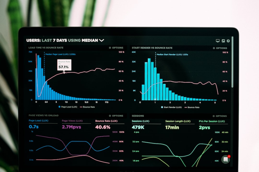
Why does choosing the right picture sizes for your website matter?
Every element on your website contributes to the overall user experience, and the size of your pictures is no exception. Choosing the right picture sizes is crucial for several reasons:
1. Page Loading Speed:
Large image files can significantly slow down your website’s loading time, leading to frustrated visitors who may leave before even seeing your content. On the other hand, smaller image sizes can improve loading speed and ensure a smooth browsing experience.
2. Mobile Optimization:
With the increasing number of users accessing websites on their mobile devices, it is essential to optimize your images for mobile viewing. Choosing the right picture sizes ensures that your images are displayed correctly and do not cause any distortion or loss of quality on smaller screens.
3. Visual Appeal:
The size of your pictures directly affects their visual impact. Images that are too small may not catch the viewer’s attention or fail to convey the intended message. On the other hand, oversized images can overwhelm the page and distract from the main content. Choosing the right picture sizes allows you to strike the perfect balance between visual appeal and overall layout.
4. Search Engine Optimization (SEO):
Search engines consider website loading speed as one of the ranking factors. By optimizing your images and choosing the right sizes, you can improve your website’s SEO and increase your chances of appearing higher in search engine results.
5. User Experience:
When users visit your website, they have certain expectations regarding how images should display and interact with the content. Properly sized images ensure that users can easily view, understand, and navigate your website, enhancing their overall experience. To summarize, choosing the right picture sizes for your website is crucial for page loading speed, mobile optimization, visual appeal, SEO, and user experience. Taking the time to understand and implement the appropriate sizing guidelines will help you create a website that is visually appealing, user-friendly, and optimized for performance.
The impact of picture size on website speed and performance
The size of the pictures used on a website can have a significant impact on its speed and overall performance. Here’s why choosing the right picture sizes is crucial:
1. Page Loading Speed:
Large image files can significantly slow down a website’s loading time. When visitors encounter slow-loading pages, they may become frustrated and choose to leave before even seeing the content. On the other hand, using smaller image sizes can improve loading speed and ensure a smooth browsing experience for users.
2. Bandwidth Usage:
Larger image files require more bandwidth to load, which can cause issues for users with slow internet connections or limited data plans. By optimizing picture sizes, website owners can reduce the amount of data that needs to be transferred, improving the experience for all users.
3. Mobile Optimization:
With the increasing number of users accessing websites on their mobile devices, it is essential to consider how pictures are displayed on smaller screens. Using appropriately sized images ensures they are displayed correctly and do not cause any distortion or loss of quality on mobile devices.
4. Server Resources:
When a website has numerous high-resolution images, it puts a strain on server resources. This can lead to slower response times and potential downtime, especially during times of high traffic. Optimizing picture sizes helps alleviate this strain and ensures the website remains functional and accessible.
5. User Experience:
Users have certain expectations when it comes to how images should display and interact with the content on a website. Properly sized images contribute to a positive user experience by allowing users to easily view, understand, and navigate the website without any lag or slowdowns.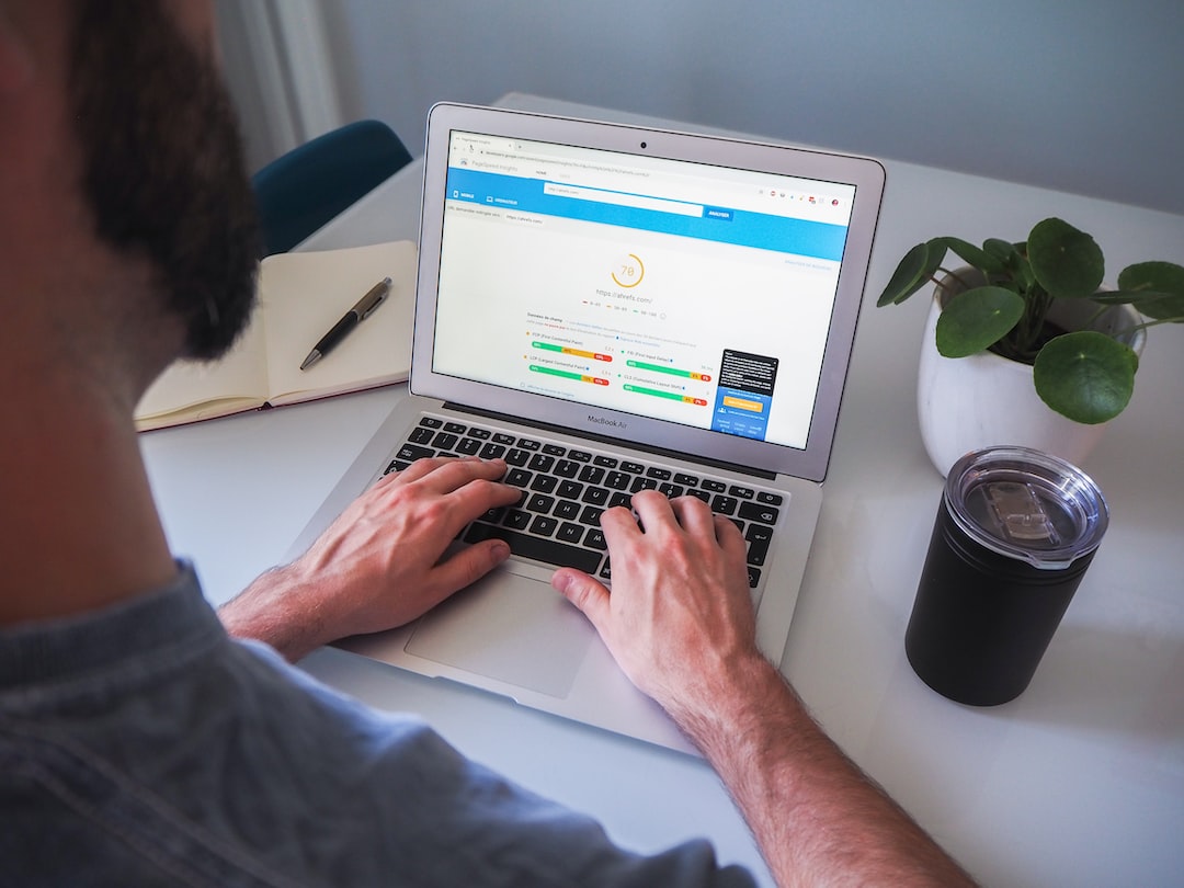 Overall, choosing the right picture sizes for a website is crucial for optimizing its speed, performance, and user experience. By implementing appropriate sizing guidelines, website owners can create a visually appealing and user-friendly platform that is optimized for optimal performance.
Read also
- Enhance Your Instagram Game with the Best Font Generator
- Unleashing the Power of Branded Words for Memorable Messages
- Top 10 YouTube Video Converters for Blockbuster Creations
- Unlock Peak Productivity with the Ultimate Time Manager Guide
Determining the optimal picture sizes for different sections of your website
Determining the optimal picture sizes for different sections of your website is important for achieving a visually appealing and user-friendly platform. Here are some guidelines to help you choose the perfect picture sizes for each section:
1. Homepage and Landing Pages:
On your homepage and landing pages, you want to make a strong visual impact to capture visitors’ attention. Therefore, it is recommended to use larger images that are high-resolution to create a visually stunning first impression. However, be cautious not to compromise the page loading speed. Optimize these images without sacrificing quality to ensure a smooth browsing experience.
2. Blog Posts:
When it comes to blog posts, it’s crucial to balance image quality with loading time. Use medium-sized images that are optimized for web viewing. These images should enhance the content and make it visually appealing without causing delays in page loading.
3. Portfolios and Galleries:
If you have a portfolio or gallery section on your website, it is essential to showcase your work with high-quality images. In this case, larger picture sizes can be used, as long as they are optimized and properly compressed for web viewing. This allows visitors to get a detailed view of your work without compromising loading speed.
4. Product Pages:
If you have an e-commerce website, it is important to optimize your product images for a seamless shopping experience. Use high-resolution images that allow customers to zoom in and see the product details. However, make sure to compress these images for the web to maintain fast loading speeds.
5. Contact and About Pages:
For contact and about pages, smaller image sizes can be used since the focus is more on the text and information rather than visuals. Optimize these images to ensure fast loading times and a smooth browsing experience.
Remember, it’s crucial to use responsive design techniques to ensure that the images adjust accordingly on different devices and screen sizes. This will ensure that your website remains visually appealing and user-friendly across various platforms. By carefully considering the context and purpose of each website section, you can determine the optimal picture sizes that will enhance the overall user experience, improve loading times, and showcase your content in the best possible light.
Tools and resources for resizing and optimizing pictures
When it comes to resizing and optimizing pictures for your website, there are several helpful tools and resources available. These tools can assist you in ensuring that your images are properly sized and optimized, resulting in faster loading times and an improved user experience. Here are five tools and resources that you can utilize:
1. Adobe Photoshop:
Adobe Photoshop is a popular and comprehensive photo editing software that offers a wide range of features for resizing and optimizing images. With Photoshop, you can easily adjust the dimensions and resolution of your pictures, as well as compress them to reduce file size without compromising quality.
2. Canva:
Canva is an online graphic design platform that offers a user-friendly interface and a variety of templates for resizing and optimizing images. It allows you to easily crop, resize, and compress your pictures, making them suitable for web use. Canva also offers pre-designed templates for different sections of your website, ensuring that your images are properly sized for specific areas.
3. Squoosh:
Squoosh is a free web application developed by Google that allows you to resize, compress, and convert images in real time. It offers a simple drag-and-drop interface and provides instant feedback on the resulting file size and image quality. Squoosh supports various image formats and offers advanced compression options for optimal optimization.
4. TinyPNG:
TinyPNG is an online tool specifically designed for compressing PNG and JPEG images. It uses smart lossy compression techniques to reduce file size without significantly impacting image quality. Simply upload your images to TinyPNG, and it will automatically compress them for web use. You can download the optimized images individually or as a ZIP file.
5. ImageOptim:
ImageOptim is a free desktop application for Mac users that optimizes images without compromising quality. It supports various image formats and utilizes advanced compression algorithms to reduce file size. ImageOptim also provides options for batch processing, allowing you to optimize multiple images at These tools and resources are just a few examples of what is available to assist you in resizing and optimizing pictures for your website. Depending on your specific needs and preferences, you may find additional tools and resources that suit your requirements. Remember to always test the performance of your optimized images to ensure that they load quickly and maintain visual quality.
Best practices for maintaining picture quality while reducing file size
When it comes to optimizing images for your website, it’s important to strike a balance between maintaining picture quality and reducing file size. By following some best practices, you can ensure that your website loads quickly while still displaying high-quality images. Here are six best practices for maintaining picture quality while reducing file size:
1. Choose the Right Image Format:
Different image formats have different characteristics and are suitable for different types of images. For photographs or images with complex color gradients, JPEG is often the best choice. For images with sharp lines and text, such as logos or illustrations, consider using PNG. SVG is a great option for scalable vector graphics.
2. Resize Images Appropriately:
Before uploading an image to your website, make sure to resize it to match the dimensions required for its display on your site. Avoid using HTML or CSS to resize large images, as this will still require the user’s browser to download the full size and then resize it.
3. Use Compression Techniques:
Compression is essential for reducing the file size of your images without sacrificing too much quality. There are various compression techniques you can apply to your images, such as reducing the number of colors, adjusting the image’s quality settings, or using image compression tools like TinyPNG or ImageOptim.
4. Optimize Image Metadata:
Image metadata, such as EXIF data, can contain unnecessary information that adds to the file size. Remove any metadata that is not required for your website, as it can significantly reduce the file size without affecting the image quality.
5. Minimize Image File Size:
Further with CSS Sprites and Lazy Loading: CSS sprites combine multiple images into a single file, reducing the number of HTTP requests made to the server. Lazy loading is a technique that delays the loading of non-visible images until they are needed, which can significantly improve page load times.
6. Regularly Test and Optimize:
It’s essential to regularly monitor and test the performance of your website’s images. Use tools like Google PageSpeed Insights or GTmetrix to analyze the loading speed and image optimization of your website. These tools will provide suggestions on how to further optimize your images for better performance. By following these best practices, you can ensure that your website maintains high-quality images while still loading quickly and providing a positive user experience. Remember to strike a balance between image quality and file size to ensure optimal performance.
Testing and adjusting picture sizes for optimal user experience
Testing and adjusting picture sizes for optimal user experience is an essential step in the process of choosing the perfect picture sizes for your website. Ensuring that your images are not only visually appealing but also load quickly and seamlessly is crucial for providing a positive user experience.
Here are some testing and adjusting techniques to help you optimize your picture sizes:
1. Conduct A/B Testing:
A/B testing involves comparing two versions of a webpage, with each version displaying different picture sizes. By analyzing user behavior and performance metrics, such as bounce rate and conversion rate, you can determine which picture sizes are most effective in engaging your audience and driving desired actions.
2. Monitor Loading Speed:
Use tools like Google PageSpeed Insights or GTmetrix to measure the loading speed of your website with different picture sizes. These tools provide valuable insights and recommendations for optimizing image loading times. Aim for a loading speed of three seconds or less, as slow loading can negatively impact user experience and lead to increased bounce rates.
3. Optimize for Different Devices:
Test your website’s performance and image display on various devices, including desktops, laptops, tablets, and mobile phones. Ensure that your picture sizes are responsive and adaptive to different screen sizes and resolutions. This will help maintain image quality and readability across devices.
4. Consider Content Relevance:
Adjust picture sizes based on the relevance and importance of the content they accompany. For critical or high-priority content, such as hero images or product showcases, larger picture sizes may be appropriate to enhance visual impact. For supporting or secondary content, smaller picture sizes can be used to optimize loading speed without compromising the overall user experience.
5. Utilize Browser Caching and Content Delivery Networks (CDNs):
Implement browser caching and CDNs to improve the delivery and loading speed of images. Browser caching allows repeat visitors to load images from their cache instead of making repeated server requests. CDNs distribute your website’s content across multiple servers worldwide, reducing the distance and time it takes for images to reach your users.
6. Regularly Monitor Performance:
Continuously monitor and analyze the performance of your website’s images. Regularly check loading times, user feedback, and performance metrics to identify any potential issues or areas for improvement. Stay updated with advancements in image optimization techniques and implement them as needed. By testing and adjusting picture sizes for optimal user experience, you can strike the perfect balance between high-quality visuals and fast loading speeds. Remember that the goal is to engage and delight users while ensuring a seamless browsing experience on your website.
Conclusion
Choosing the perfect picture sizes for your website is crucial for providing an optimal user experience. It goes beyond visually appealing images; it involves ensuring that your pictures load quickly and seamlessly. However, the process doesn’t end with simply selecting the right sizes. Continuous monitoring and optimization are essential to maintain a high-performing website.
By regularly monitoring the performance of your images, you can identify any issues or areas for improvement. Check loading times, user feedback, and performance metrics to gauge the effectiveness of your picture sizes. If you notice slow loading speeds or negative user experiences, it may be time to adjust your image sizes.